
Laurapakora Design / News / Mon 18 Jun 2012
Laurapakora Design… New branding!
Well, I have been working on this for a while now, and introduced it a few months back, but I have finally got everything done, finished and printed…
This is such a difficult project, I am my own biggest critic, and a perfectionist, so this has taken a while… I have been tweaking and tweaking as I have found it difficult to stop!
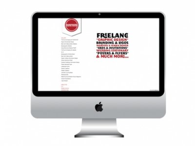
Firstly, here’s the new website, it’s been up and running for a while, and I’ve finally finished the tweaks. (For now…) Laurapakora Design.
I have kept the branding minimal as this is my style, and also to not detract from the photos of my work. All photos have been taken by either myself or my husband-to-be.
The typefaces used are Museo Sans for the text and navigational links – a wonderful typeface designed by Jos Buivenga, from Exljbris Font Foundry and Megalopolis, which I have really enjoyed playing with (especially the ligatures and alternatives), designed by Jack Usine from Smeltery.
I have extended the branding to my blog (as you can see), using the “Forever” theme by Automattic, combined with the Museo Sans typeface through Typekit and a little tiny bit of custom CSS.
With the Facebook welcome page and the website home page I have been playing around with typography using the fantastic Megalopolis typeface, describing what I do, but also conveying different messages. I have been trying to change the home page occasionally, with a new year message, Valentines Day sentiments and links to different things I have been involved in such as the Sketchbook Project.
Finally, here is the print work…
I designed a letterhead and basic invoice/quote template, following on from the website style, with the logo in the left corner. I have stuck to the two main colours of red and black on white, keeping it clean and simple.
The compliment slips follow the same design, again using the small version of the typographic description of what I do:
Finally, I designed a business card and flyer. The business card is similar to the letterhead and compliment slip, printed on a coated silk card. The flyer extends the typographic idea, with a longer and bigger typographic design. These all use Museo Sans throughout for the main text. The flyer is eye catching, even when in a pile of other flyers (I tested this at the Bliss Ladies Nite with great results!)
Phew! Finally all done and in place. Keep an eye on here and on the website as there is new and updated work going up at the moment, and thanks for following me!
TTFN,
Laura
For more information visit http://laurapakoradesign.wordpress.com/2012/06/18/laurapakora-design-new-branding/