
Laurapakora Design / News / Fri 24 Feb 2012
New Work: New rebrand for Laurapakora Design
This has been a long time coming. The original branding for my freelance graphic design was designed around 2 years ago, and was designed to be an interim until I had some time to tidy it up and make both the brand and the website a bit tidier.
However, as the months went on, I really started to dislike it, it was quite girly, and I didn’t feel my website looked as professional as I would have liked. Unfortunately (or fortunately, however you want to look at it…) I was too busy to put a great deal of time into getting the new brand up to scratch and it sat untouched for some time.
In the last few months I have had a bit more spare time, DIY is not taking over the house anymore, and over the winter I haven’t had any sailing to distract me… so I have been working hard on getting the new branding and logo in place.
I started at looking at the old logo and trying to just tidy it up and redesign it.
The more I played with it, the less I liked it, so I started looking at other designs and ideas.
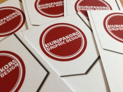
I really liked the idea of a stamp, and once I had this in mind, I started to develop the logo to this final logo:
I even had a stamp made so I could use it as a stamp…
Once I had got the logo and branding sorted, I designed my cards as well as other stationary. I stuck to red and black type, using the typeface Megalopolis.
One of the questions I get asked a lot is what exactly do I design, so I put it on my cards!
The next challenge was my website. It’s primary function was to be a portfolio, with a brief profile and a link to my blog and contact details. Behance had just launched their “prosite” so I thought I’d give it a go…
As most of my portfolio was on behance, it made building the site much easier. It’s really easy to use and I was able to change the appearance at HTML and CSS level and use type kit so it was easy to design the site exactly how I wanted it to look, without having to add each project manually as they were already there.
I stuck to Megalopolis and Museo for all the type, and to the red and black colours. I kept the interface and navigation simple and minimal so not to detract from my work.
I was able to link to my existing WordPress blog within my website, so it maintains the look and appearance. Very handy!
The projects have nice big images and scroll down the page so I can have as much or as little information as I need.
I was also able to incorporate social networking with “like” buttons for Facebook and “tweet” buttons as well as “appreciate this” buttons linked direct to my behance account.
All in all a very good system! The new website is now up and running – Laurapakora Design and the new brand is now in use!
For more information visit http://laurapakoradesign.wordpress.com/2012/02/24/new-work-new-rebrand-for-laurapakora-design/